

Little story.
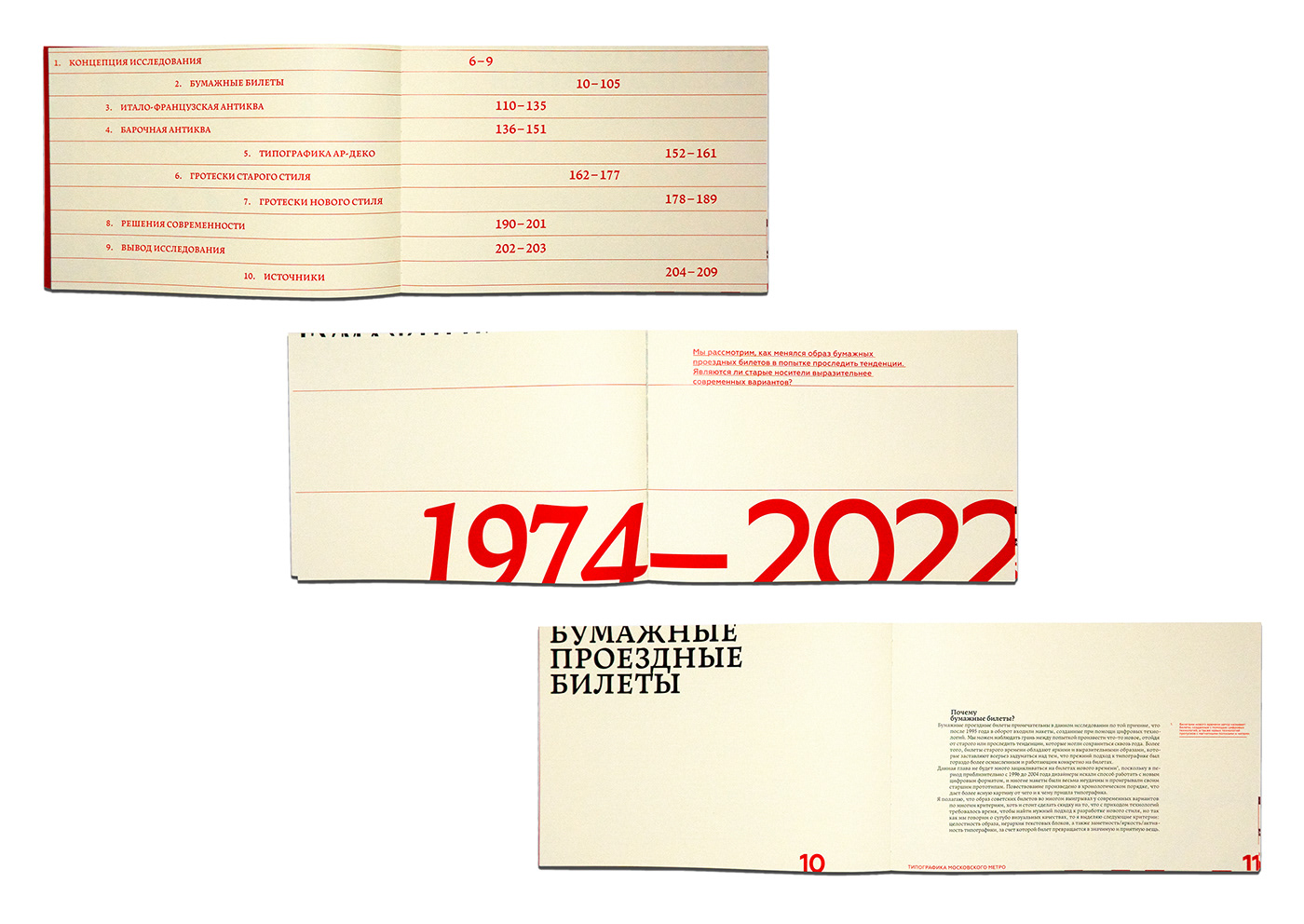
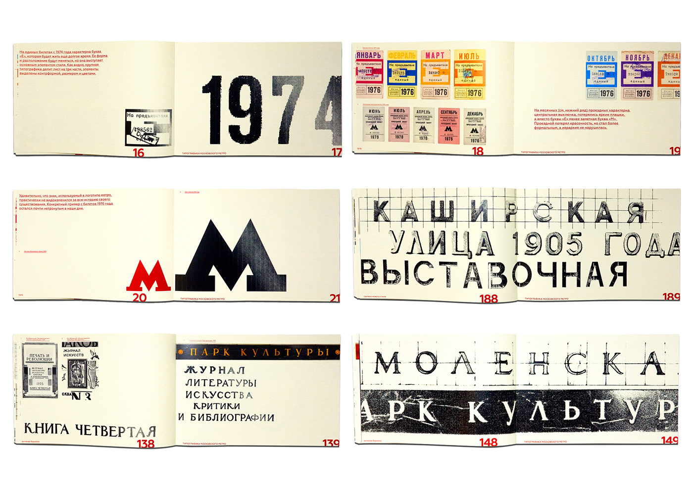
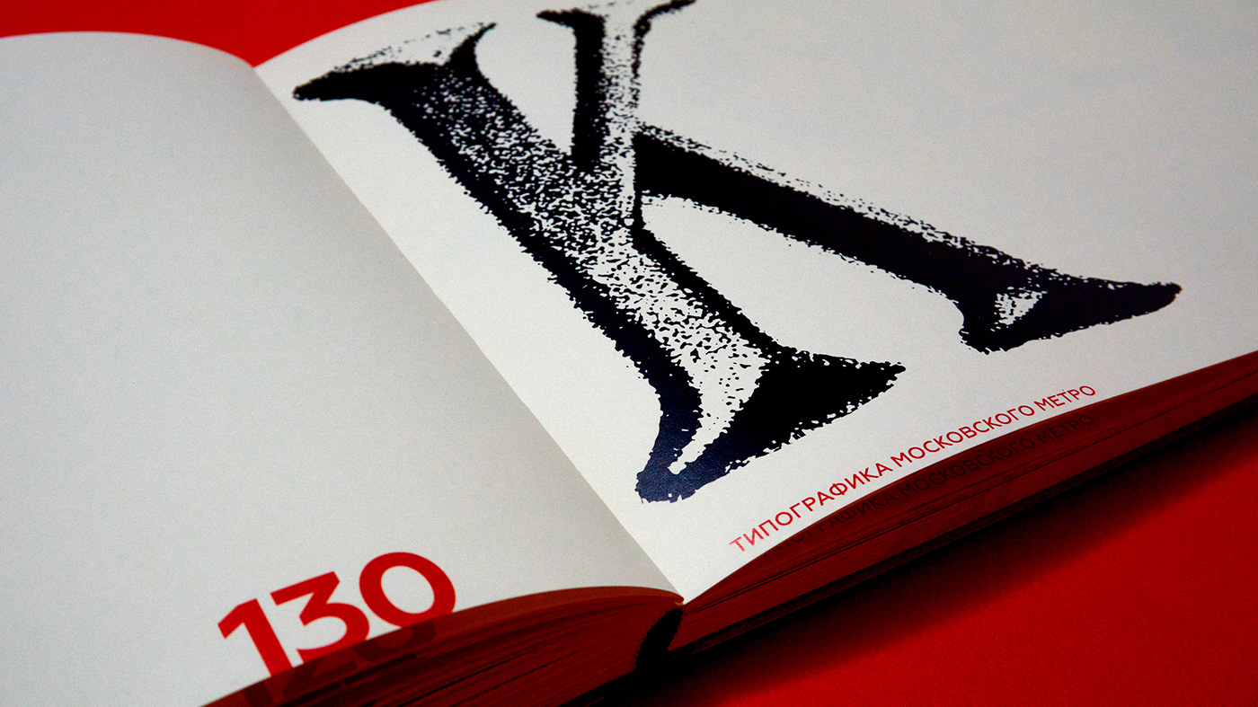
Visual research shows the typography features in the Moscow Metro, which opened in 1935. In the book, you can look at the names of stations and paper tickets. I compare these media with each other and try to identify improvement or decline in typography work in the subway space.
The main hypothesis: if we compare the situation with the last century, we can see that the compositions used to be much more expressive and did not need additional graphics. The typography on the tickets was much brighter and more active, which created a unique image of the metro. Thus, the typography in the Moscow metro was better developed in the last century.
The book has become a whole collection of graphics from the subway. The metro has become not only an architectural asset, but also an interesting medium for graphic designers.


Moscow Metro Typography
Burakov Vladislav
Printed in PRO.ЩЕ Studio
2022
Pages: 212
Format: 300x200 mm


